7 Practical Tips for Better Microcopy | Learn UXD


- Use personal pronouns
- Start with a verb
- Prevent concerns
- Use natural language
- Default to active voice
How to Achieve Soft, Friendly and Consistent UI Design
General visual consistency
How to make our design look sleek and consistent? Start with preparing this:
- Choose colors you want to use
- Choose a font(s) you want to use
- Decide on how deep/blurred you want your shadows to be.
- If you are using icons, decide whether you want to use solid or outlines. Try not to mix them.
By now, you created your little design-system. How cool! 😎
Now you should stick to it.
If you want your shadows to look even more fanciful, make the shadow have the same color as the element that casts it, then lower the opacity. Ideally, the background would have a similar tone, too.
Making gradients look more smooth and delicate
Choose the right color for the font, so it matches the background.
Nobody told me UX would be like this
The first pass will almost always suck.
In Creativity, Inc.: Overcoming the Unseen Forces That Stand in the Way of True Inspiration, Ed Catmull equates new ideas to newborns. They need care and nurturing — space to breathe. Think of your initial ideas (read: designs) as a garden in the early stages. It will need constant watering and tending until the plants are strong enough to survive on their own and bear fruit. A garden doesn’t look like much in the early stages. But it has tremendous potential with the right care.
Artists work with an idea. They nurture it. This does not require ingenuity or creative genius. Forget about all of that. It doesn’t necessarily require a lot of experience either. It simply requires hard work to push through iteration after iteration. You are essentially watering the plants (the idea) and nurturing them.
“Quality is a probabilistic function of quantity.”
A genius is a genius, Simonton maintains, because he can put together such a staggering number of insights, ideas, theories, random observations, and unexpected connections that he almost inevitably ends up with something great.
Your job is not to come up with the best idea.
Your job, then, is to take the best part of others' ideas and shape them into the best idea. I always have ideas and want to be the first to get them out in the open where they can be evaluated (and hopefully adored). This is my ego at play — talking to me, telling me to show everyone just how clever I am. I’ve had to learn to keep my mouth shut and temper my ego. My job isn’t to come up with the best idea. It’s to listen and watch.
Go beyond your industry.
Creatively find the time to be creative.
Your ability to sell is often far more important than your design skills.
Decoding Google’s secret UX weapon
A peek into the brain of Scott Jenson, Google’s UX strategist.
- Sweat the small stuff.
- Build ugly prototypes, fast.
He calls it Assertive Instinct — the state where you are so hyped about your idea you can’t even imagine a world where it could be wrong or insufficient or simply incompatible with what people actually need. - Look for ideas in weird places.
- Don’t criticize. If you do, ask one thing, politely.
Modern CSS grid solutions to common layout problems

Dynamic centered layout
We all know margin: 0 auto to center a layout. Ideal for article pages, right? But what if you want elements like images to exceed the maximum width of the article?
a11y.css
This CSS file intends to warn developers about possible risks and mistakes that exist in HTML code. It can also be used to roughly evaluate a site's quality by simply including it as an external stylesheet.
The Designer's Guide to Letter-Spacing | Webdesigner Depot
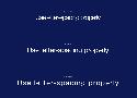
There are a lot of different typefaces and a single rule doesn’t apply to all of them. Experiment with letter-spacing and do what seems right to you. There are some simple guidelines that will lead you in the right direction, especially when working with body text:
Letter-Spacing Headlines
If you are using well designed fonts, you can be sure that they are calibrated well, and you won’t need to make any major adjustments to them. However, the problem with headlines is that at larger scales the space between letters looks unbalanced. It can be fixed by increasing or decreasing the letter-spacing value.
There are no strict rules for letter-spacing — there are a lot of typefaces and all of them require an individual approach — but if you look at how big companies like Google and Apple treat their typefaces, you can find a lot of valuable information there.
How to make Perfect Drop Shadows in UI Design | by Thalion | Jun, 2020 | Prototypr
box-shadow: 0px 8px 24px rgb( 0, 0, 0, .15 );
x: 0px
y: 8px
Blur: 24px
Alpha: 15%
Color: #000000